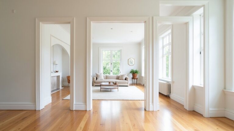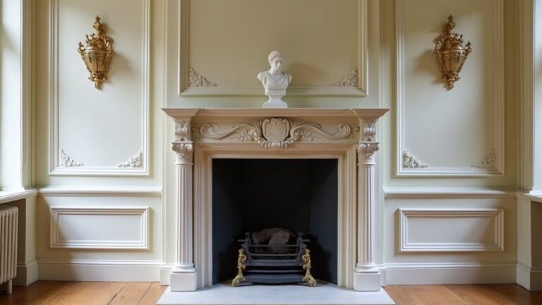

You probably don’t know that most “matching” paint mishaps come from clashing undertones, not the colour itself. You’ll get a calmer, more intentional home if you pick a whole-home palette of 3–5 shades, then keep every choice either warm or cool from room to room. You can shift emphasis with the 60–30–10 rule and repeat accents in textiles and metals so progressions feel seamless—but there’s one quick way to test sightlines before you commit.
Key Takeaways
- Pick a whole-home base palette of 3–5 colours, using one neutral for large areas and 1–2 accents for personality.
- Keep undertones consistent (warm or cool) across paint, flooring, and fixed finishes to avoid clashing and ensure cohesion.
- Transition colours room to room by repeating key shades and adjusting intensity, especially along main sightlines and open-plan areas.
- Use the 60–30–10 rule to balance dominant, secondary, and accent colours while maintaining a consistent scheme throughout the home.
- Repeat accents through metals, textiles, and decor, and stick to consistent paint sheens to unify trim, walls, and high-traffic zones.
Choose a Whole-Home Base Colour Palette
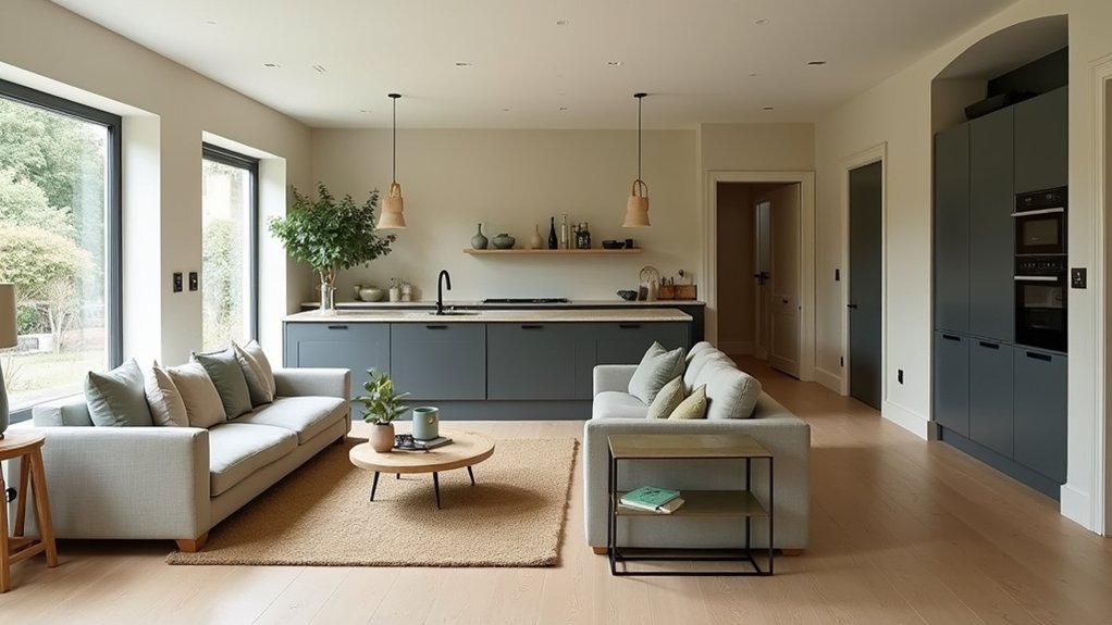
Start with one whole-home base palette—think 3–5 core colours that you’ll repeat in every room—to give your interior an instant sense of flow. Choose a dependable neutral for large surfaces, a secondary tone for adjacent spaces, and 1–2 accents that show up in textiles, art, and cabinetry for a designer-level rhythm.
Use Color psychology to match function: calmer hues for bedrooms, energising notes for kitchens, and grounded shades for entryways where first impressions matter.
Then lock in Paint finish choices so your palette looks intentional under different lighting: matte or eggshell on walls to soften glare, satin on trim for crisp edges, and a durable semi-gloss in high-traffic zones.
Test swatches in morning and evening light.
Keep Undertones Consistent (Warm vs Cool)
Although two paints can look identical on a swatch, their undertones (the subtle warm or cool cast underneath the main colour) will either make your rooms feel seamlessly connected or quietly “off.” To keep a cohesive scheme, commit to one temperature direction across your fixed finishes—warm neutrals with yellow/red bases (creamy whites, greige, taupe) or cool-leaning tones with blue/green bases (crisp whites, true greys).
Then build your accent colours within that same family. Check your Color temperature in real lighting: morning, afternoon, and evening. Compare samples beside tile, flooring, and countertops to lock Undertone harmony.
If your floors skew warm oak, choose warm whites and brass; if they read ash or slate, lean cooler and pair with chrome or nickel.
Transition Your Cohesive Colour Scheme Room to Room
Once you’ve nailed your undertones, carry that same colour logic through the house by repeating key shades and shifting their intensity from room to room. Use Color flow techniques like a “60–30–10” distribution that stays consistent, while you swap which shade leads: deeper in the entry, mid-tone in the living area, and lighter in halls for lift.
Plan sightlines the way clients experience them—standing at doorways and open-plan thresholds. Match adjacent rooms with shared notes (one paint colour, two related hues), then adjust saturation to suit daylight and function.
Keep Focal point harmony by echoing the dominant hue at each room’s hero element—feature wall, built-ins, or a large artwork—so transitions feel intentional, not choppy. Document it on a simple palette map.
Repeat Accents With Neutrals, Metals, and Textiles
When your wall colours and undertones are set, you can lock the whole scheme together by repeating accents through your neutrals, metals, and textiles. Use Accent repetition to echo one or two key hues in small doses: a cognac leather pull, a moss velvet cushion, or a smoky glass vase.
Keep your base calm with layered neutrals—ivory, greige, and soft charcoal—so the accents read intentional, not busy.
Choose one metal family, then vary the finish for a designer look: brushed brass with antique brass, or polished nickel with satin.
Let Texture coordination do the heavy lifting: pair boucle with matte linen, ribbed ceramics with flat-weave rugs, and add a subtle pattern that includes your accent colour. You’ll get cohesion without matching.
Frequently Asked Questions
What Paint Finish Works Best for High-Traffic Rooms and Hallways?
Choose eggshell or satin; they’ll survive a stampede in high-traffic rooms and hallways. You’ll get serious paint durability with a washable surface. Keep finish sheen moderate to hide scuffs; go semi-gloss only on trim.
How Do I Choose Artwork That Complements My Existing Wall Colours?
Choose artwork by sampling your wall’s undertones, then echo or contrast them using color harmony techniques like complementary accents. Pick artwork framing styles that match your room’s vibe—thin metal for modern, warm wood for intermediary.
Should I Match My Ceiling Colour to Walls or Keep It Bright White?
You don’t have to match: use bright white if you want lift and crisp edges—bright white advantages include extra bounce and clean trim contrast. Match ceiling vs walls when you’re embracing cozy, contemporary “color-drenching” and lower glare.
How Can Lighting Temperature Change How Paint Colours Look at Night?
Like a stage spotlight, lighting temperature reshapes paint at night: warm bulbs pull hues golden; cool LEDs push them crisp or icy. You’ll notice lighting ambiance shifts colour perception—always test swatches under your fixtures before committing.
What Are the Best Tools for Testing Paint Colours Before Committing?
You’ll get the best read using peel-and-stick swatches, large brush-out boards, and virtual color matching apps. Prioritize paint sample testing across day/night, under your bulbs, and beside finishes, then document results in photos.
About the Author