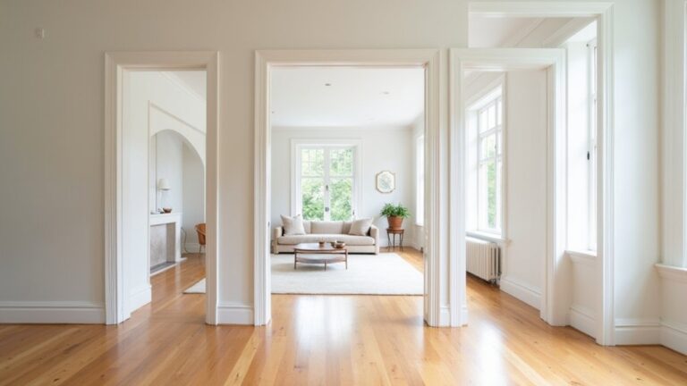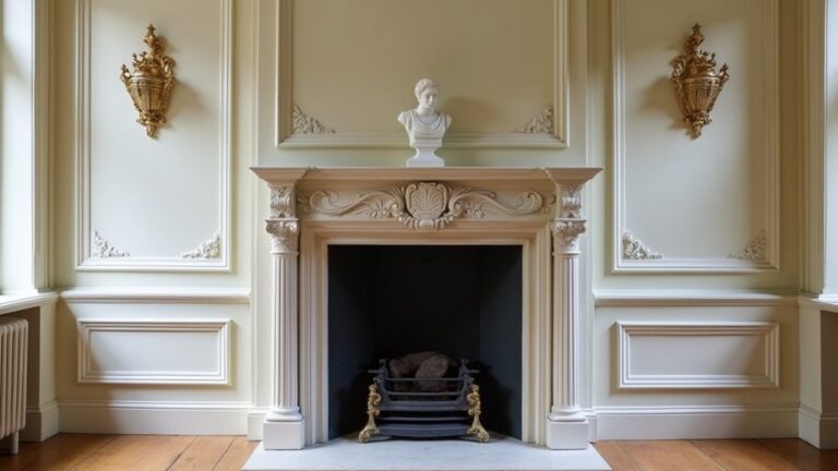

Coincidentally, the colour you’ve been considering is often the one that either softens your whole room or keeps your mind switched on. You’ll get the calmest result when you choose muted, low-chroma tones—think gentle greens, dusty blues, and warm off-whites—then ground them with matte finishes and layered linen textures. But lighting changes everything, and one “perfect” shade can turn tense fast, so you’ll want to see what happens next…
Key Takeaways
- Choose low-saturation warm off-whites, creamy ivories, or gentle greiges for a calm, light-reflecting base that feels soft, not stark.
- Use muted blues or soft greens with greyed undertones to promote rest, pairing them with warm neutrals like oat, sand, or cream.
- Match colour temperature to room orientation: warmer tones suit north light, while cooler sages and smoky blues work well in south light.
- Pick matte or eggshell wall finishes to reduce glare and create a velvety, relaxing look; reserve satin for trim.
- Test large swatches on multiple walls morning and night, avoiding icy whites and high-chroma brights that feel clinical or energizing.
Calming Bedroom Colours: What Actually Matters
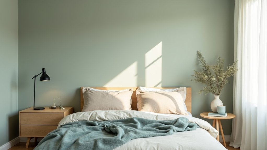
If you’re choosing calming bedroom colours, what matters most isn’t the “right” shade on a swatch—it’s how that colour behaves in your space across the day. Start with Color psychology: soft greens and muted blues signal rest, while warm off-whites feel clean without turning stark.
You’ll get better Mood enhancement when you pick undertones that flatter your bedding, flooring, and wood furniture, so nothing feels visually “off” at bedtime.
Keep saturation low and contrast gentle; high-chroma accents can stay, but limit them to small, removable pieces. Choose matte or eggshell finishes to reduce glare and make walls feel velvety.
Finally, test large samples near your headboard and closet so you notice how the hue supports your nightly routine.
Bedroom Colours by Lighting (North, South, Bulbs)
Because light changes the *temperature* and depth of every paint colour, the best bedroom palette starts with your orientation and your bulbs, not a trendy swatch.
If your room faces north, daylight skews cool and flat, so choose warmer-leaning greens, blushes, or clay-tinted tones to keep skin and walls from looking gray.
South-facing rooms get golden light; you can handle cooler blues, soft sages, or smoky lilacs without them turning icy.
East light feels crisp in the morning, so mid-tones stay balanced.
West light intensifies at dusk, making colours read richer and sometimes louder.
Then check your Lighting fixtures: LED Colour temperature matters.
Around 2700K calms and warms; 3000K stays clean; 4000K can sharpen and cool.
Best Neutral Bedroom Colours for a Restful Base
Where do you start when you want your bedroom to feel instantly calmer without locking yourself into a bold colour? You begin with neutrals that act like a soft exhale: warm off-whites, creamy ivories, and gentle greiges. These Mood enhancing hues reflect light cleanly, smooth visual clutter, and make your linens and wood tones look intentional, not busy.
Use Color psychology insights to steer undertones: choose pink-beige or oat if you crave coziness, stone or mushroom if you want a modern, grounded feel, and pale taupe if you like warmth without yellow. Keep saturation low and finish matte or eggshell for a velvety, restful surface.
Then layer texture—bouclé, washed cotton, and linen—to deepen calm without adding colour noise.
Best Blue Bedroom Colours for a Sleepier Feel
If you want a sleepier feel, you can shift your palette toward soft sky blues that read airy in daylight and calm under warm bedside lighting.
You’ll get the most restful look by choosing muted, grey-leaning tones for larger walls and pairing them with crisp whites or sandy neutrals.
For a more dramatic trend-forward touch, you can add deep navy as an accent—think a painted headboard wall, tailored bedding, or matte hardware that grounds the room without feeling heavy.
Soft Sky Blue Shades
While bold blues can feel energising, soft sky-blue shades settle your bedroom into a calmer, sleepier mood. You’ll notice they brighten the room without the sharpness of pure white, giving walls a clean, airy lift that still feels cosy at night.
Lean into Color psychology by choosing a blue with a grey or powder undertone; it reads quieter and reduces visual “buzz.” These Mood enhancing hues pair beautifully with warm neutrals—oat, sand, and soft cream—so your space feels balanced, not chilly.
Keep the finish matte or eggshell to diffuse light and hide wall texture, and echo the tone in linens for a seamless, cloudlike look. If your room lacks daylight, pick a slightly warmer sky blue to avoid looking icy.
Deep Navy Accent Ideas
Because deep navy absorbs light and softens contrast, it creates an instant cocooning effect that feels made for winding down. Use it as an accent, not a takeover: paint the headboard wall, choose a navy upholstered bed, or layer in linen pillows and a matte throw.
Deep navy accents look especially modern with brushed brass, walnut, and warm white bedding, keeping the room calm but not flat. For a subtle trend-led move, add navy bedside lampshades or a framed abstract with inky tones.
If you want bold colour pairing, balance navy with dusty blush, clay, or muted ochre in one repeat—like a rug stripe, cushion piping, or artwork—so the palette feels intentional, not busy. Add blackened hardware for depth.
Best Green Bedroom Colours for a Quiet, Natural Look
Whether you’re drawn to biophilic design or simply want a calmer place to land at night, green bedroom colours bring a quiet, natural balance that still feels current.
Choose a muted sage for walls if you want an airy, spa-like base that flatters warm woods and creamy linens. If you prefer something moodier, try olive or deep moss on a single wall or on built-ins to create depth without feeling heavy.
Keep the look refined with Green accents—think eucalyptus bedding, vintage glass lamps, or botanical artwork—rather than bold contrasts.
Layer in natural textures like linen drapes, jute rugs, and oak nightstands to soften edges and add warmth.
Finish with brushed brass or matte black hardware for a modern, grounded feel.
Soft Pastel Bedroom Colours That Won’t Overwhelm
If you want colour without the noise, choose muted pastels like dusty blush, misty lavender, powder blue, or soft sage for a calm, modern feel.
Keep them from reading sugary by pairing them with warm whites, light greige, or natural wood tones.
You’ll get a gentle, airy bedroom palette that still feels polished and grown-up.
Muted Pastel Palette Picks
How do you get that airy, calming bedroom look without tipping into sugary sweetness? Start with muted pastel palette picks that read refined: misty blush, powdery sage, washed lavender, and pale denim blue. You’ll keep the vibe serene by choosing tones with greyed undertones, so the colour feels grown-up and diffused, not candy-bright.
For a modern, trend-aware update, try a barely-there apricot on walls, then echo it with dusty rose bedding.
Prefer cooler? Go for soft eucalyptus paint with cloud-blue accents in cushions or a throw.
If you want depth without drama, add a muted mauve on a headboard wall or inside shelving.
These calming bedroom colours soften light, flatter skin tones, and make evenings feel slower.
Balancing Pastels With Neutrals
Muted pastels feel most restful when you anchor them with quiet neutrals that keep the room looking airy, not saccharine. Pair blush, misty lavender, or powder blue with warm white walls, oatmeal linen bedding, and pale oak to soften contrast while adding structure.
Use Color psychology to guide balance: keep pastels on larger planes if you want gentle mood-lifting, but ground them with stone, sand, or greige so your eyes can “rest” between hues.
Follow decorating trends by mixing matte paint with textured neutrals—bouclé, boucle, wool throws, jute, or travertine lamps—to add depth without louder color.
Limit pastel accents to one or two: a headboard and cushions, or curtains and art. Finish with black or brass hardware for crisp definition.
Warm Bedroom Colours That Still Feel Relaxing
While cooler shades often get all the credit for calm, warm bedroom colours can feel just as relaxing when you keep the undertones soft and the contrast low. Think clay beige, creamy apricot, blush terracotta, or muted honey—mood-enhancing hues that glow gently under lamplight and soften morning sun.
To keep the mood serene, choose matte or eggshell finishes and layer textiles in similar values: oatmeal linen, caramel throws, sand rugs.
Build complementary colour schemes with grounded partners like warm greige, smoked olive, or dusty rose, then repeat them in small accents for a tailored look.
If you want a modern update, try a cinnamon-tinted neutral on the walls and bring in darker warmth through walnut furniture and bronze hardware for quiet depth.
Bedroom Colour Mistakes That Kill a Calm Vibe
Even if you’ve picked a soothing shade, a few common colour missteps can make your bedroom feel restless instead of restorative. First, don’t ignore Color psychology: icy whites and high-chroma brights can read clinical or energising at night, especially under cool LEDs. You’ll get a calmer result by softening contrast and keeping saturation low.
Next, watch undertones. A “greige” that turns green beside warm wood, or a blush that skews peach under sunset light, creates subtle visual tension. Test large swatches on multiple walls and check them morning and evening.
Finally, make smart paint finish choices. Glossy walls bounce light and highlight texture, while dead-flat can scuff; choose eggshell or matte for most bedrooms, and reserve satin for trim.
Frequently Asked Questions
How Do I Choose Calming Bedroom Colours if I Rent and Can’T Paint Walls?
Stay serene, soft, and stylish: you can choose calming bedroom colours by layering muted linens, rugs, and curtains. Add removable wall decals in sage or sand, and echo tones with furniture accents, art, and lighting.
What Are the Best Calming Bedroom Colours if I Have Colour Blindness?
You’ll do best with soft neutrals—warm greige, oatmeal, muted navy, charcoal, and dusty sage—since they stay calm despite colour perception shifts. If you’ve got sensory sensitivities, choose low-contrast palettes and matte, textured fabrics.
Can Bedroom Colour Affect Mood for People With Anxiety or Depression?
Yes, bedroom colour can affect your mood with anxiety or depression—like tuning a radio. You’ll notice psychological effects from hues and light. You can try colour therapy: soft greens, dusty blues, warm neutrals.
What Calming Colours Work Best for a Small Bedroom With Low Ceilings?
Choose soft, cool tones like misty blue, pale sage, or warm off-white; they’ll visually lift low ceilings and calm you. Use Color psychology and Feng shui principles: keep ceilings lighter, add monochrome layers.
How Can I Incorporate Calming Colours Using Textiles Instead of Paint?
You can layer calming colour through bedding, curtains, and rugs, using textile colour coordination in muted sage, sand, or dusty blue. Choose calming fabric patterns—soft stripes or micro-geometrics—and repeat tones in pillows.
About the Author