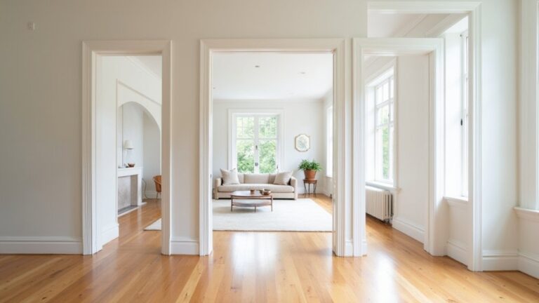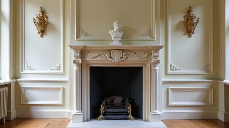

Coincidentally, the colours that make a narrow hallway feel wider are usually the ones you’d pick to brighten a dim room. You’ll get the best results by choosing high-LRV whites, soft greiges, or airy pastels that bounce light, then pairing them with the right sheen and trim contrast. But lighting direction and undertone can make the same paint look crisp or cramped—so your next choice matters more than you think…
Key Takeaways
- Choose high-LRV paint colours (70–90) like warm off-whites, soft whites, pale greiges, or airy pastels to reflect light and widen halls.
- Match undertones to daylight: warmer for north-facing halls, cooler/cleaner for south-facing, and adjust for east/west light shifts.
- Use warm whites in dark, narrow corridors, pairing with slim furnishings and warm metals or pale wood to amplify brightness.
- Try soft greige or misty sage/sea-glass tones for gentle depth without gloom, balanced with light ceilings and warm white trim.
- Increase reflectivity with eggshell or satin walls and semi-gloss trim, and test large swatches along the full hallway before committing.
Choose High-LRV Hallway Paint Colours First

If your hallway feels tight or dim, start by choosing a paint colour with a high Light Reflectance Value (LRV), because it bounces more available light around the space. Aim for soft whites, pale greiges, and airy pastels in the LRV 70–90 range to lift walls and visually widen circulation paths.
Use color psychology to keep the passage calm and welcoming: warm off-whites reduce sterility, while cool-leaning tints feel crisp and spacious. Let historical color trends guide your undertones—creamy whites echo traditional plaster, while muted stone shades nod to classic architectural palettes without reading heavy.
Check the LRV on the paint deck, then test a large swatch along the full run so you see it in motion.
Match Hallway Colours to Your Lighting Direction
Because light changes dramatically depending on which way your hallway faces, match your paint’s undertone to the direction of natural daylight so the colour stays bright instead of turning dull or dirty.
In north-facing halls, you’ll see cooler, flatter light, so choose paints with balanced or slightly warm undertones to keep walls crisp.
In south-facing halls, strong warm light can exaggerate yellow, so lean into cleaner, cooler undertones for a fresher read.
East light looks bright early and cooler later; west light warms up in the afternoon, so test samples morning and evening.
Coordinate your lighting fixtures with the same undertone family, and keep hallway furniture finishes consistent so the whole corridor reads wider and cleaner.
Warm White Hallway Colours for Dark, Narrow Halls
Although crisp whites can look sharp on a swatch, a warm white usually performs better in a dark, narrow hallway by lifting the walls without turning cold or grey. Choose a shade with a subtle yellow, peach, or creamy undertone to reflect lamplight and daylight softly, keeping corners from reading dingy.
Use the same warm white on trim and doors to blur edges and visually widen the corridor, then vary sheen: eggshell on walls, satin on woodwork for gentle contrast.
Add Decorative hallway accents in brass, oak, or woven textures to reinforce warmth without busy pattern. Apply furniture placement strategies by keeping consoles slim, floating hooks or shelves, and leaving a clear walking line; less bulk means more bounce from the paint.
Soft Greige Hallway Colours for Gentle Depth
If you want gentle depth without closing in a narrow hall, choose a soft greige with warm undertones to keep the space looking lifted, not flat or cool.
You’ll get the best result when you pair greige with light—crisp white trim, pale ceilings, and reflective finishes that bounce illumination along the corridor.
This balance adds subtle contrast while still making the hallway feel brighter and more open.
Choosing Warm Greige Undertones
When you want a narrow hallway to feel brighter without looking stark, warm greige undertones give you the ideal middle ground between beige warmth and grey sophistication. Choose a greige with a subtle yellow, taupe, or rosy base to prevent the colour from turning flat or chilly in tight runs of wall.
Test it at both ends of the corridor; undertones shift with adjacent rooms and flooring.
Keep trim a clean neutral so the greige reads refined, not muddy. Use decorative accessories like brass hooks, woven runners, or warm wood frames to echo the undertone and add cohesion without crowding the passage.
If your walls feel featureless, consider wall texture options such as fine limewash, matte mineral paint, or a soft eggshell finish to build gentle depth.
Pairing Greige With Light
Because greige can read dramatically different from one end of a hallway to the other, pair it intentionally with your light: choose a soft greige that brightens in low illumination and holds gentle shadow in stronger daylight, so the corridor gains depth without closing in.
If your hallway relies on warm bulbs, test greiges with a subtle beige base to avoid a flat, muddy cast. Under cooler LEDs or north light, pick a greige with a whisper of warmth so walls don’t turn steely.
Use Balancing contrast by keeping trim and ceilings a clean, light white; this sharp edge lifts the whole passage.
For Enhancing texture, let the colour skim across paneling, plaster, or wallpaper, then add matte paint to soften glare and satin on doors to catch light.
Always sample at both ends, morning and evening.
Pale Blue and Green Hallway Colours That Calm
Although narrow hallways can feel visually busy, pale blues and soft greens instantly quiet the space while reflecting light in a clean, airy way. Choose a powdery blue with a soft grey undertone to reduce glare and make walls recede, which visually widens the passage.
For greens, lean toward misty sage or sea-glass tones; they balance warmth and freshness without feeling sharp under LEDs or daylight. Use colour psychology to your advantage: blue slows the pace and eases progressions between rooms, while green signals restoration and steadiness.
For decorating ideas, pair these hues with warm white trim, pale oak, and brushed brass to keep the corridor bright yet grounded. Finish in eggshell for durability and gentle light bounce.
Pastel Hallway Colours That Still Read Neutral
When you want a narrow hallway to feel brighter without leaning stark, pastel neutrals give you lift while staying grounded. You can use soft greige pastels to reflect light cleanly, warm blush neutrals to add gentle warmth, and muted sage tones to keep the space airy yet composed.
These shades read neutral in passing, so your corridor feels wider, calmer, and easy to style.
Soft Greige Pastels
If you want a hallway to feel brighter without tipping into “nursery pastel,” soft greige pastels deliver that sweet spot between warmth and restraint. You’ll get gentle lift from the pastel value, while the greige base keeps the look grounded and quietly sophisticated.
From a color psychology standpoint, these shades read calm and orderly, which helps a tight corridor feel less compressed. Use them to soften harsh overhead lighting and to smooth progressions between rooms with different undertones.
Aim for a light, slightly warm greige pastel on walls, then keep trim a clean off-white for crisp definition that doesn’t narrow the space. In busy entry hallways, prioritize paint durability: choose a washable eggshell or satin, and select a scuff-resistant formula to maintain that bright, powdery finish.
Warm Blush Neutrals
Because they sit right on the edge of pink and beige, warm blush neutrals brighten a narrow hallway while still reading as a true neutral. You’ll get a soft, light-reflective lift without the sweetness that can make tight corridors feel busy.
Choose a blush with a warm undertone to prevent it from turning chalky under cool LEDs, and test it beside your trim to keep contrast crisp.
Use a satin or eggshell finish to bounce light and hide scuffs at shoulder height.
For Decorative accents, repeat warm metals, natural oak, or tan leather to reinforce the beige side of the colour.
Keep furniture placement slim and wall-hugging—think narrow consoles and shallow shelves—so the hue reads airy, not crowded, in transit zones.
Muted Sage Tones
Muted sage takes the same soft, light-lifting approach as blush neutrals but shifts the warmth into a grounded green-grey that still reads neutral in a narrow hallway. You’ll get calm brightness without the sterile feel that cool whites can create, especially under mixed bulbs and low daylight.
Choose muted sage tones with a higher LRV so walls bounce light while still masking scuffs along high-traffic routes. Pair them with crisp white trim to sharpen edges and visually widen the corridor, then echo the hue in a runner or artwork for continuity.
In north-facing halls, lean slightly warmer; in south-facing light, pick a more greyed sage to prevent a yellow cast. These shades also sit naturally within nature-inspired palettes, so wood, rattan, and black hardware look intentional.
Best Paint Finishes for a Brighter Hallway
How much light your hallway colour reflects often comes down to the finish you choose, not just the shade. For the brightest result, pick a soft sheen that bounces light without shouting: satin or eggshell works well on most walls, lifting colour and making narrow corridors feel wider.
Matte can look sophisticated, but it absorbs light and highlights scuffs in high-traffic passages. Use semi-gloss on trim, doors, and skirting to create crisp contrast and a subtle light frame that guides the eye forward.
If you’re exploring Accent wall ideas, keep the feature wall in eggshell so it reads rich yet airy. Pair your finish with well-placed decorative hallway lighting to maximise reflectance and minimise shadows along the run.
Frequently Asked Questions
How Can Mirrors or Artwork Increase Brightness in a Narrow Hallway?
You can boost brightness by using Mirror placement to bounce daylight and fixtures along the corridor. Add Artwork lighting with focused sconces or picture lights; you’ll highlight colour, reduce shadows, and visually widen tight walls.
Should Hallway Trim and Ceiling Match Wall Colour or Be Contrasting?
Match trim and ceiling to walls when you want seamless flow—like a quiet exhale. Choose contrasting trim options when you need definition. Pair with Decorative wall accents to guide sightlines, and you’ll balance depth and polish.
What Are the Best Hallway Paint Colours for Homes With Pets or Kids?
Choose warm greige, soft taupe, muted sage, or midtone blue-gray; they hide scuffs and fur. Use Pet friendly paints with washable, low-VOC formulas, and Kid proof finishes in satin or durable eggshell.
How Do I Choose Hallway Paint to Flow With Adjacent Room Colours?
Choose one undertone across rooms and repeat it in your hallway with a slightly lighter or deeper value. Test under Lighting options, and use Texture finishes like eggshell to connect spaces while hiding wear.
What Paint Preparation Steps Prevent Patchiness in Long, Narrow Corridors?
Patchiness vanishes like magic when you clean, sand, fill, and prime uniformly, then cut-in and roll wet edges in one direction. Use Lighting techniques to check flaws, and add Texture enhancements by de-nibbing between coats.
About the Author