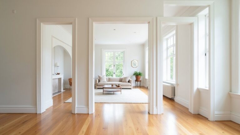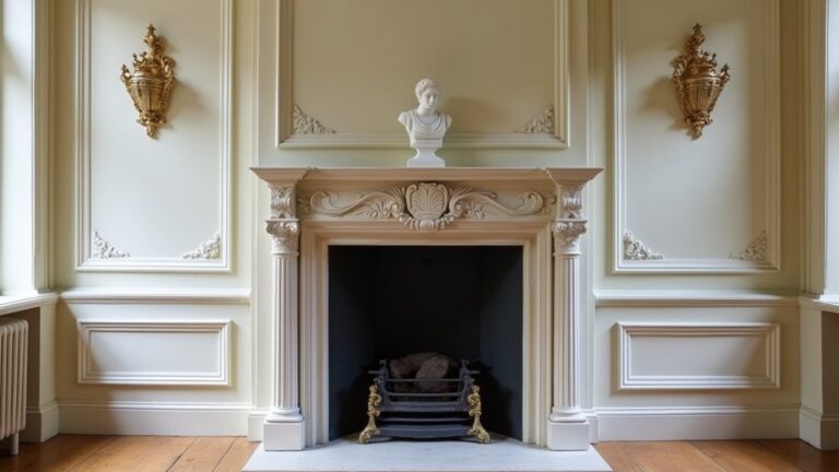
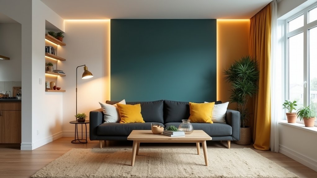
You can refresh your living room fast by pairing a modern, mood-based colour palette with smarter lighting zones. Start with warm whites or muted sage as your base, then add a controlled pop—terracotta, teal, or inky navy—using the 60–30–10 rule. Layer dimmable LEDs for ambient, task, and accent light, and fine-tune Kelvin to shift from crisp daytime to softer evenings. The key is where you place each element, and what you adjust first…
Key Takeaways
- Choose a mood-first modern palette: calming warm whites/greige, energized terracotta/teal, or luxe taupe/charcoal, matched to your room’s daylight.
- Apply the 60–30–10 rule: 60% main wall colour, 30% layered neutrals in upholstery/rugs, 10% bold accents in art and accessories.
- Test paint swatches in morning and evening light, and match undertones to flooring to avoid clashes like pink-beige with orange wood.
- Update finishes for a modern look: matte walls, eggshell in high-traffic areas, satin trim, and semi-gloss doors or built-ins for clean contrast.
- Layer smarter lighting with dimmers: warm 2200–2700K ambient glow, targeted task lamps by seating, and accent lights to highlight art and texture.
Choose Modern Living Room Colours by Mood
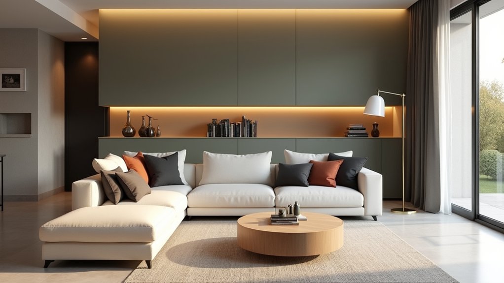
Whether you want your living room to feel calm, energized, or quietly luxe, you can choose modern colours by starting with the mood you want to live in every day.
For calm, lean into warm whites, greige, and muted sage; they soften contrast and reduce visual noise, so your space feels breathable. If you crave energy, try clay terracotta, inky teal, or punchy citron in controlled doses to spark conversation without chaos.
For quiet luxury, choose mushroom taupe, charcoal, and deep olive with matte finishes that read tailored, not trendy.
Let Color psychology guide you: cooler hues slow the room down, while warm notes pull people in. Test swatches morning-to-night to confirm the emotional impact under real light.
Build a Modern Palette With the 60–30–10 Rule
You’ll get a modern, designer-balanced look fast when you apply the 60–30–10 rule: start by choosing a dominant hue that sets the room’s tone across your largest surfaces.
Next, keep it current by balancing secondary neutrals through upholstery, rugs, and layered textures so everything reads cohesive, not flat.
Then finish strong with bold accent pops—think pillows, art, and a statement object—that give your space that polished, trend-forward edge.
Choose A Dominant Hue
After you’ve defined the vibe you want—calm, bright, moody, or warm—lock in a dominant hue to anchor the whole room. In the 60–30–10 rule, this is your 60%: the colour you’ll see first and most often.
Use Color psychology to choose with intent—sage reads restorative, inky navy feels tailored, clay terracotta brings lived-in warmth, and soft greige keeps it gallery-clean.
Translate that decision into wall paint choices that flatter your light: north-facing rooms handle warmer undertones; south-facing spaces can take cooler, crisper shades without going flat.
Sample large swatches on multiple walls, then check them morning, afternoon, and lamp-lit at night. Once it looks consistent, commit and build around it.
Balance Secondary Neutrals
With your dominant hue locked in, bring in secondary neutrals to handle the 30% and keep the room looking current, not matchy. Think warm greige with crisp white, or soft mushroom with charcoal; the goal is Secondary neutral balance that reads layered, not busy.
Use one neutral as your upholstery anchor and the other for casegoods, curtains, or an area rug so the contrast feels intentional. Lean on Complementary color schemes in a quiet way: if your main tone skews cool, pick a neutral with a subtle warm undertone, and vice versa.
Repeat that undertone across finishes—matte paint, brushed metal, pale oak—to create cohesion. Keep values (lightness/darkness) varied so the palette has depth without visual noise.
Add Bold Accent Pops
Once the 60% base and 30% secondary neutrals feel dialed in, let the final 10% go bold so the room reads modern instead of monotone. Use Bold accent pops to signal intention: a lacquered side table in cobalt, a chartreuse lumbar pillow, or a single oversized art print with a hot-coral hit.
Keep the accent colour consistent across 3–5 touchpoints so it looks curated, not random. For Modern colour schemes, pair your pop with a grounding metal (brushed brass, blackened steel) and repeat it in lighting details—tinted glass, a coloured cord, or a shade liner.
You’ll get a sharper silhouette and better contrast without repainting. Rotate accents seasonally to refresh fast.
Pick Modern Paint Colours (Undertone + Finish)
Even if you’re keeping the same furniture, modern paint instantly updates a living room when you nail the undertone and choose the right finish.
Start with Undertone selection: in north light, pick warm greige or creamy off-white to prevent a cold cast; in south light, choose a clean neutral or soft mushroom to stay crisp. If your floors skew orange, avoid pink-beige and lean taupe; if they’re cool, skip blue-gray and go balanced.
Next, match Paint finish options to how you live. Use matte on walls for a velvety, high-end look that hides flaws; choose eggshell for kid- and pet-proof wipeability.
Go satin on trim for modern contrast, and reserve semi-gloss for doors or built-ins where durability matters.
Add Modern Colour With Textiles and Accents
Because colour reads more intentional in soft goods than on fixed surfaces, you can modernize your living room fastest by layering textiles and a few high-impact accents.
Start with a tight palette—two neutrals plus one saturated note like ochre, ink, or terracotta—then repeat it across the room for cohesion.
Mix Textile textures to make the scheme feel current: bouclé with matte linen, velvet against nubby wool, and a subtle geometric weave to sharpen the look.
Swap in Accent cushions in varied scales (solid, micro-pattern, bold stripe) while keeping one common colour thread.
Add a throw that’s slightly oversized and casually draped for that styled-not-stiff finish.
Finally, introduce one lacquered tray or sculptural vase to echo the new colour and pull it all together.
Split Modern Living Room Lighting Into Zones
While overhead fixtures still have a place, your living room looks far more modern when you split lighting into purposeful zones—ambient for overall glow, task for reading or work, and accent to highlight art, shelving, or texture.
Start with Zone division based on how you actually use the space: sofa conversations, media viewing, a reading chair, and display moments. Place a floor lamp beside the sectional for task focus, then add a small table lamp near the entry console to create a welcoming ambient pool.
Aim accent light at a gallery wall or open shelving to sharpen depth and make colours feel richer. With Smart lighting, you’ll group fixtures by zone, not by switch location, so scenes match your routine—movie night, hosting, or calm wind-down.
Upgrade Living Room Lighting With LEDs and Dimmers
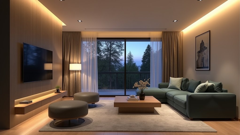
Once you’ve mapped your lighting zones, upgrade each one with LED bulbs and dimmers to fine-tune mood, comfort, and energy use. Swap legacy lamps for high-CRI LEDs so colours read true and finishes look premium.
Then prioritize LED placement: put brighter bulbs in task-ready fixtures and lower-lumen options where you want softer spill, keeping glare off the TV and sightlines.
Add Smart dimming with app or voice control so you can save presets for hosting, reading, and winding down. Choose compatible dimmer switches (LED-rated) to prevent flicker and buzzing, and match bulb type to fixture—A19 for table lamps, BR for cans, G9 for compact sconces.
You’ll cut watts fast, reduce heat, and gain smoother control across every zone.
Use Accent Lighting (Kelvin + Placement) for Mood
Even if your main fixtures handle the heavy lifting, accent lighting sets the tone by dialing in both colour temperature (Kelvin) and placement. Aim for 2200–2700K for warm ambient evenings; it softens paint colours, flatters skin tones, and makes neutrals feel richer.
Shift to 3000K near reading chairs or a desk so you stay alert without the harshness of 4000K.
Use creative placement to sculpt the room: tuck LED strips behind a media unit for halo glow, add an uplight in a corner to lift ceiling height, and angle a picture light at artwork to create depth.
Place two small lamps at different heights to avoid flat lighting and reduce glare. You’ll get a layered, modern mood on demand.
Frequently Asked Questions
How Can I Refresh a Living Room on a Tight Budget?
Start by rearranging furniture, then add Budget friendly decor like thrifted cushions; 78% of shoppers say small upgrades boost happiness. Use DIY painting tips to refresh walls, swap bulbs, and style shelves with curated finds.
Do Modern Colours Work Well in Small Living Rooms?
Yes, modern colours work great in small living rooms—you’ll make them feel bigger and sharper. Use Color psychology: soft neutrals expand, bold accents energize. Pair sleek Lighting fixtures and layered lamps to reduce shadows, add depth.
How Do I Coordinate Wall Colours With Existing Furniture?
Start with your sofa or rug and pull two undertones for Color pairing; then choose a wall shade one step lighter. 60% of homeowners regret paint choices—so test swatches. Use Furniture matching via warm/cool wood harmony.
What’s the Best Way to Hide or Manage Visible Lighting Cables?
You’ll hide visible lighting cables best with sleek cable management: paintable raceways, cord covers, or in-wall kits. Use concealment techniques like adhesive clips behind furniture and under rugs, keeping runs straight, minimal, and on-trend.
How Long Does It Usually Take to Repaint and Update Lighting?
You’ll usually need 2–4 days: one for prep and painting, 24 hours for paint drying, and 1–2 days for lighting installation. You’ll stay on-trend by scheduling pros, minimizing downtime, and ensuring crisp, clean finishes.
About the Author